Element
Foundations that grow with the product.
Element is a shared effort across design, engineering and product. As engineering lead, I work on the architecture and tooling that help teams build with it.
- My role
- Design-system engineering lead
- Team
- 2–4 engineers, alongside design and product
- Platforms
- Web and native
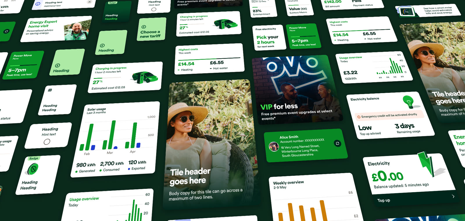
Built alongside the product
Our shared challenge was to bring web and app patterns closer together while giving teams a practical path from older versions of Element.
The wider team rebuilt the logged-in customer experience in 12 weeks. Working on both product features and Element exposed where shared components helped, and where their APIs needed to change.
Alongside design and product counterparts, my remit covers engineering architecture, standards and releases. I also implement Element upgrades and build with its components in our app and websites.
That hands-on work feeds back into the system, alongside usage comparisons and a shared Forms API for web and native.
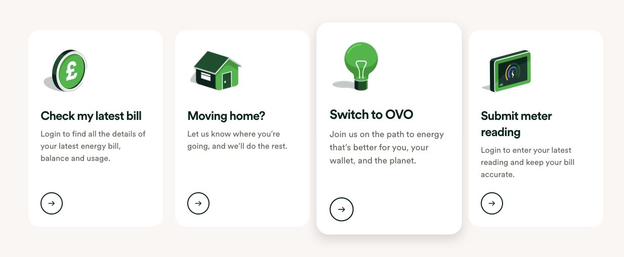
CardShared containerHeading4Card titlePSupporting copyButtonIcon-only action
Tokens with clear contracts
I established a Style Dictionary token architecture that supports brands, themes and platform outputs. Teams can extend or override tokens while retaining the shared foundations.
Missing types and missed updates caused recurring friction. Stronger typing, tests and output validation made those contracts explicit, helping engineers change and consume tokens with more confidence.
- Primitive
green-50 - Semantic
color-brand-brand - Component
button-filled-bg
The same foundations support AI-assisted development. Shared instructions and skills give coding tools our repository conventions; typed contracts, tests and visual review help us check what they produce.
Review without local setup
Flaky local Loki runs could take several attempts before a change was ready for review. Snapshot generation now runs entirely in CI, removing that setup from onboarding.
I built the pull-request sign-off workflow: reviewers approve a visual change, its baseline updates automatically, and a PR comment records the result. The team keeps control without repeating the manual work.
Understanding adoption together
The adoption dashboard is a collaboration with another engineer and our lead designer, who also manages Element. I developed much of the dashboard; we shaped its features and improvements together.
Opted-in repositories report component usage, library coverage and style deviations through react-scanner and GitHub Actions. The pilot covered a handful of projects, with wider rollout underway.
Stakeholders use it for adoption reporting. For the team, it starts conversations about overrides, upgrades and where support is needed.
24 of 200 instances with overrides
For the wider design-system context, see Jason Christie’s account of Element.
Back to selected work